Way to Go!!

Hello and welcome to another fun sketch challenge from the Pals Paper Arts Design Team!

Isn't it fun? I wanted to make a special card and this sketch turned out to be perfect for it!

This card is for my youngest son who just finished his first marching band season as a band director. It has been a season of joy and struggles, triumph and defeat, but through it all he has been a trooper and is excited to move to the next phase and still wants to be a teacher!!

Woo Hoo! I'm soooo proud of him and wanted to let him know :)

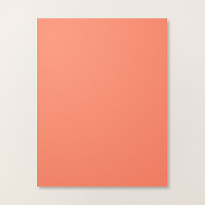
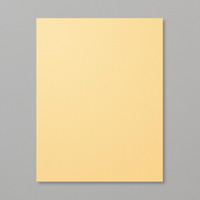
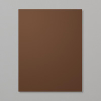
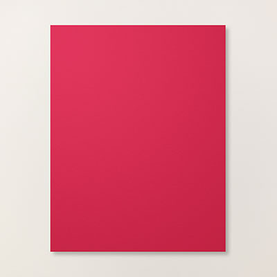
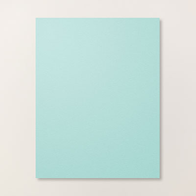
For this card I chose colors that I knew would suit my son. Soft Suede is perfect, and I adore this chevron pattern! To break it up I added Crumb Cake as a complimentary color and just added a POP of Soft Sky.

Clean, simple lines and no fru-fru for him at all. One Crumb Cake button as an accent. If you need a particular color for thread and you don't happen to have it, no worries. Just snip two thin strips of cardstock in the color you want and then thread them through the button holes. Fold them over onto themselves on the back and adhere a glue dot to keep them in place. One side of the glue dot hold the strips of paper in place, the other adheres your button to your card...easy peasy!

I hope you've enjoyed my card and that you will pop on over to the see the rest of the inspiration from the Pals Paper Arts Design Team!

Thanks for stopping by!!


Flowery Feel Goods - PPA222

Happy Thursday! I'm back today with another FUN color combination from the Pals Paper Arts Design Team:

Colors like these make designing a card EASY!!

Flowery Feel Goods - PPA222

Aren't the flowers FUN! They are from the Too Kind Stamp Set and are two-step stamps. What is a two-step stamp? Just what it sounds like. There is a background image and a foreground image. The background image provides the color of the flower and the foreground image provides the flower details. When stamping the background image, stamp off once after inking so that the color is softer. That will make the foreground image 'pop'.

Flowery Feel Goods - PPA222

I randomly stamped the flowers, adding in the smaller version as well. Then the sentiment. I chose a bold sentiment and stamped in Early Expresso so that it would hold it's own against all the color on the left. In retrospect, i could have embossed it as well. I lined the top layer with Early Expresso and So Saffron cardstock and cropped them all a bit smaller so that the Calypso Coral base would balance out the strong colors of the flowers. I couldn't leave well enough along so I 'painted' glue on the flowers randomly with my Two-Way Glue Pen and then poured Dazzling Diamonds Stampin' Glitter over the card. I L-O-V-E all the sparkle!

I found a perfect complimenting pattern paper for my envelope liner in the Gold Soiree Designer Series Paper pack. It is smooth and glossy, very elegant!

Flowery Feel Goods - PPA222

This card is going to a wonderful young lady whom I have known since she was born. She recently graduated from college with two degrees, in Physics and Astrophysics no less, and then moved clear across the country to take a dream job working with data and images from the Hubble telescope. I'm sure it's hard to be so far from her family and everything familiar so I'm going to send some love and encouragement her way. She believed she could do it, and she IS doing it! So proud!

Thanks so much for stopping by today! If you have a chance, won't you pop on over to the Pals Paper Arts challenge blog and see what wonderful things the other designers have created for you? And maybe play along with us? We would love to see what you create!

Awesome Sauce! - CTS#94

Have you ever sent a "shouty" text or email? You know the kind, where the letters are all capitalized so the writer can emphasize their point? Well, I decided to do that with today's card...

Awesome Sauce! - CTS#94

Awesome Sauce! - CTS#94

I've been trying to come up with a card to go along with this fab sentiment from the Big News Stamp Set and I haven't had much inspiration. Finally, this weekend as I was staring at it again for the umpteenth time, I had the thought that it should be emphasized with a bright color and Rich Razzleberry popped into my head. That's a bit weird in itself as Rich Razzleberry is a color I rarely use. On the heels of that thought about the color was the realization that the Sweet Taffy Designer Series Paper has a pattern paper in Rich Razzleberry which, upon first viewing, I actually thought was obnoxiously loud...and PERFECT for a SHOUTY card!

Awesome Sauce! - CTS#94

And that's how this card was born :) I really, really love how it turned out. The recipient is truly going to know that I think they are AWESOME! The card really didn't need anything else, between the shouty paper and the shouty sentiment, you would think I had it covered. But no, I HAD to add a bit of sparkle in the form of Silver Glimmer paper :) lol. Lots of fun!

But I couldn't stop there...so I made another...

Awesome Sauce! - CTS#94

I changed it up a bit with a colored card base and by trimming the DSP ever so slightly. I also heat embossed the sentiment with Clear Embossing Powder after stamping in Rich Razzleberry to give it more depth. It's hard to photograph, but it's a neat effect.

Awesome Sauce! - CTS#94

So, which one do you prefer? I couldn't decide!

The inspiration for the layout of today's card was provided by this fun sketch over at CAS(E) this Sketch. I don't always get a chance to play along but they always have such fun and inspiring sketches!

Thanks so much for stopping by!

Oh! And in case you were wondering, the paper that I used to line the envelope today is a retired pattern (plain) from the Brights Color Collection Backgrounds Designer Series paper Stacks. At the time I wondered why on earth they would give me a plain colored piece of DSP, now, over four years later, I know...to line envelopes with! Hooray!

Life's an Adventure - RS#133

Life's an Adventure - RS#133

I borrowed the Life's Adventure stamp set from a friend recently and thought that the sketch this week over at Retro Sketches would be a perfect companion to my retro, kitschy bicycle stamp:

And then, when teamed up with these fun patterns from the Flashback Designer Series Paper, winner, winner, chicken dinner!

Life's an Adventure - RS#133

I love this bicycle and the sentiment! The bicycle would be fun as a stand alone image and you would be able to add lots of different sentiments, but it's so fun with this sentiment! Perfect for anyone starting out on a new adventure: moving to a new city; taking a new job or new apartment; or as in my case, a college grad starting their adult journey!

I stamped the image in Memento Tuxedo Black Ink and the stamped just the flag again in Real Red, snipped it out, and added it to my card. I think it's a fun accent. The rest of the card is pretty straightforward, no explanation needed. I did have to raid my retired stash for the Real Red and Pool Party buttons, but that's okay because the whole feel here is retro :)

Life's an Adventure - RS#133

Thanks for stopping by!