Awesome Sauce! - CTS#94

Have you ever sent a "shouty" text or email? You know the kind, where the letters are all capitalized so the writer can emphasize their point? Well, I decided to do that with today's card...

Awesome Sauce! - CTS#94

Awesome Sauce! - CTS#94

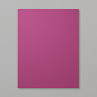
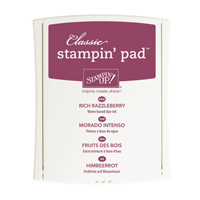
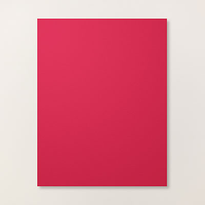
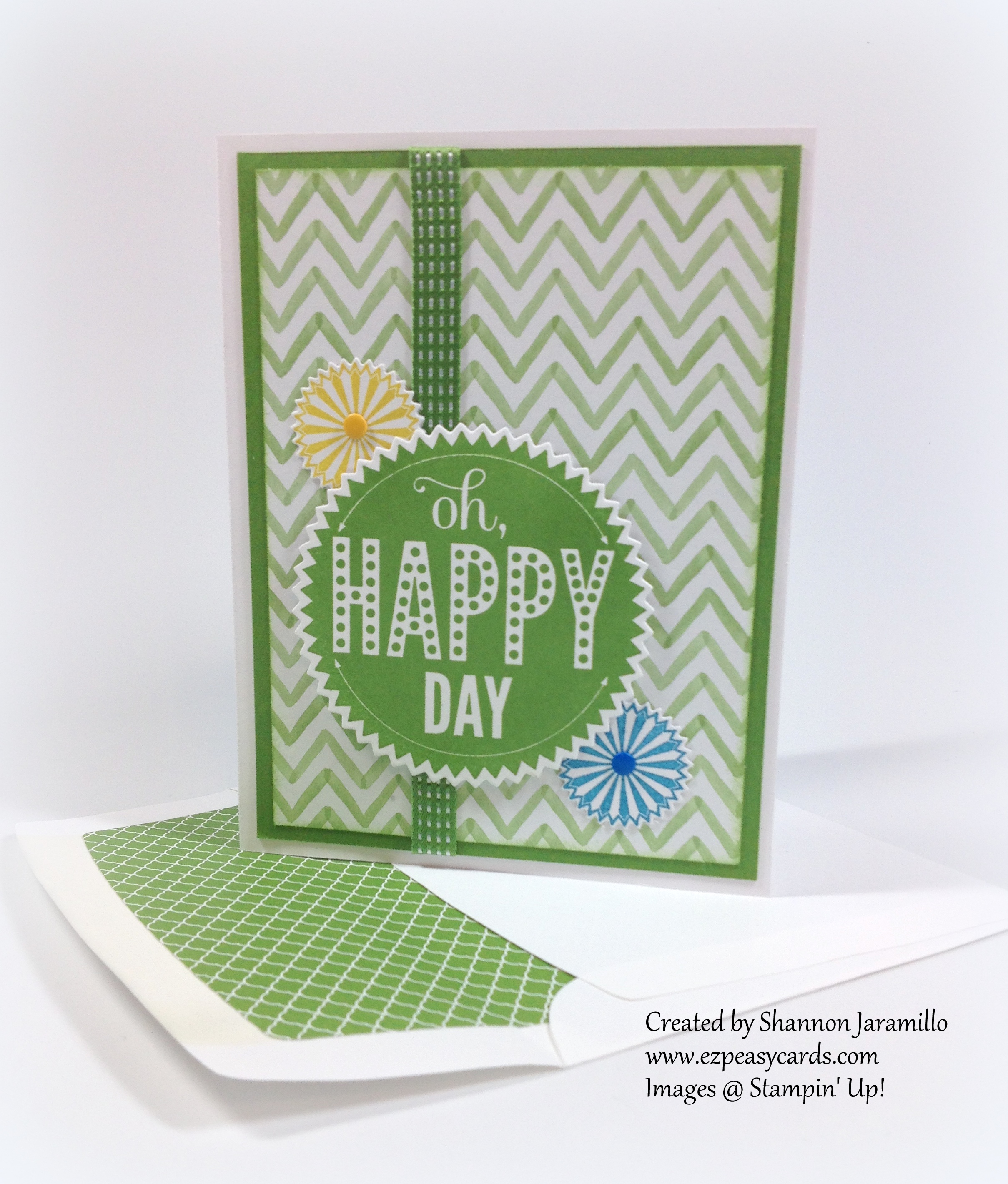
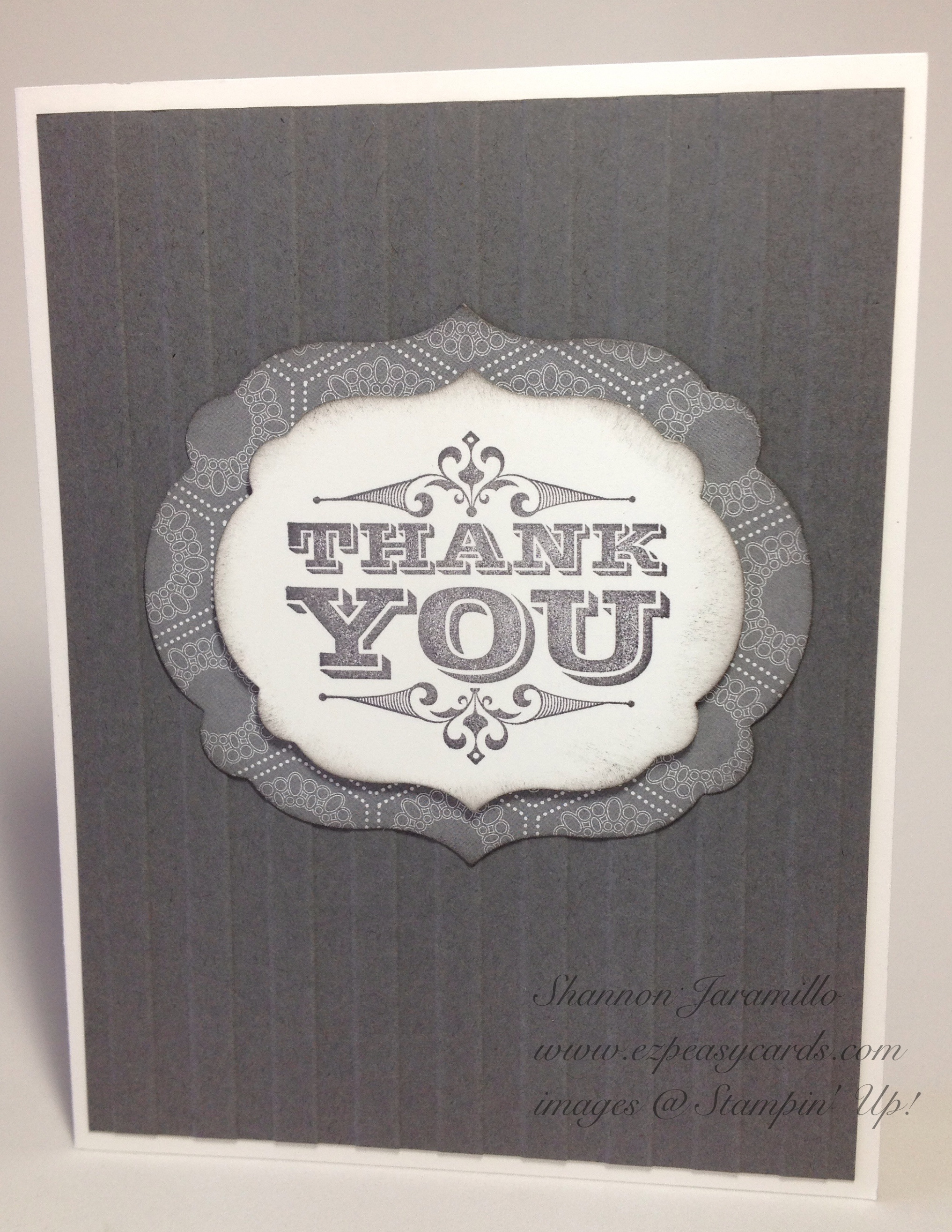
I've been trying to come up with a card to go along with this fab sentiment from the Big News Stamp Set and I haven't had much inspiration. Finally, this weekend as I was staring at it again for the umpteenth time, I had the thought that it should be emphasized with a bright color and Rich Razzleberry popped into my head. That's a bit weird in itself as Rich Razzleberry is a color I rarely use. On the heels of that thought about the color was the realization that the Sweet Taffy Designer Series Paper has a pattern paper in Rich Razzleberry which, upon first viewing, I actually thought was obnoxiously loud...and PERFECT for a SHOUTY card!

Awesome Sauce! - CTS#94

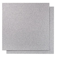
And that's how this card was born :) I really, really love how it turned out. The recipient is truly going to know that I think they are AWESOME! The card really didn't need anything else, between the shouty paper and the shouty sentiment, you would think I had it covered. But no, I HAD to add a bit of sparkle in the form of Silver Glimmer paper :) lol. Lots of fun!

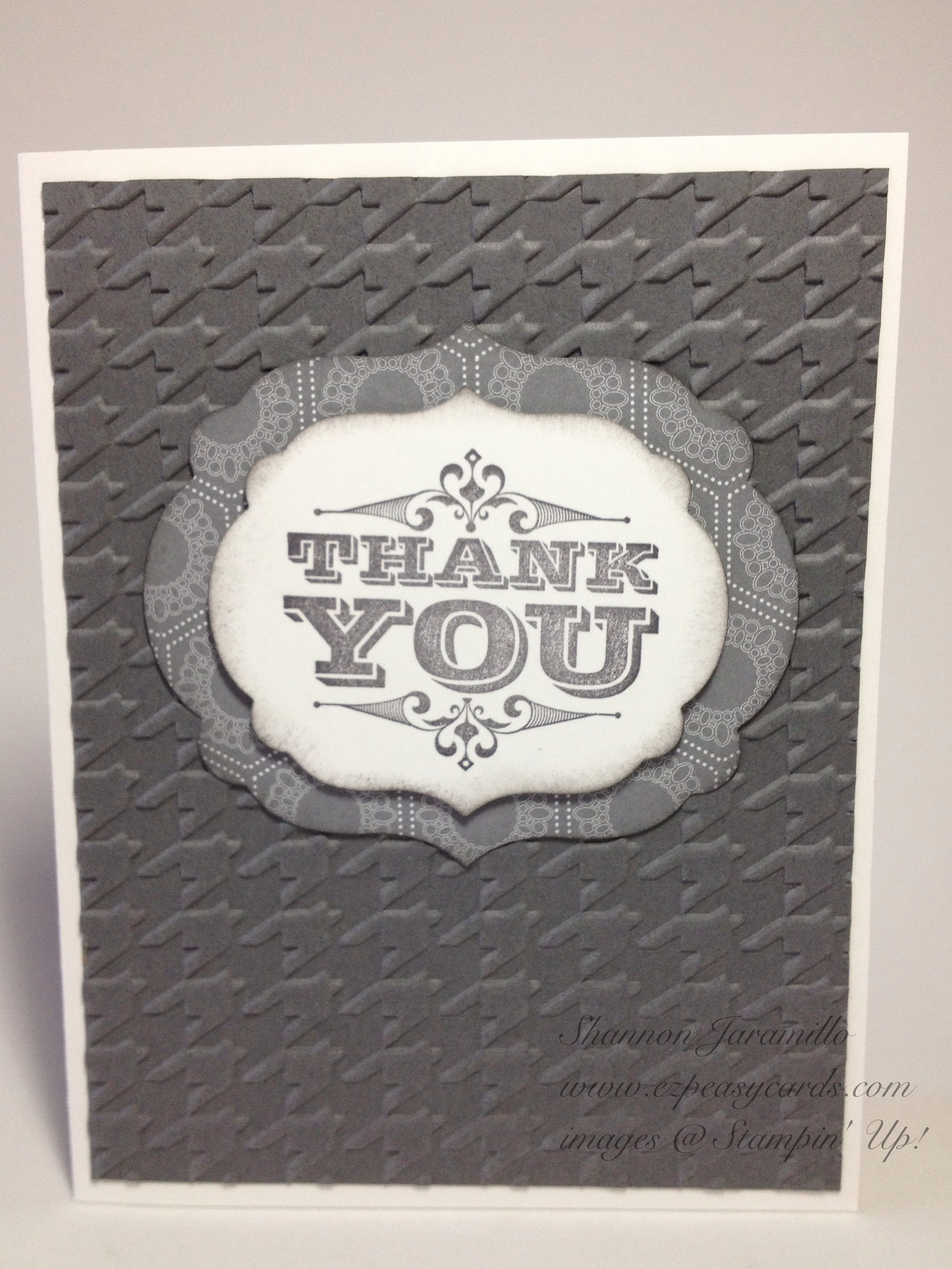
But I couldn't stop there...so I made another...

Awesome Sauce! - CTS#94

I changed it up a bit with a colored card base and by trimming the DSP ever so slightly. I also heat embossed the sentiment with Clear Embossing Powder after stamping in Rich Razzleberry to give it more depth. It's hard to photograph, but it's a neat effect.

Awesome Sauce! - CTS#94

So, which one do you prefer? I couldn't decide!

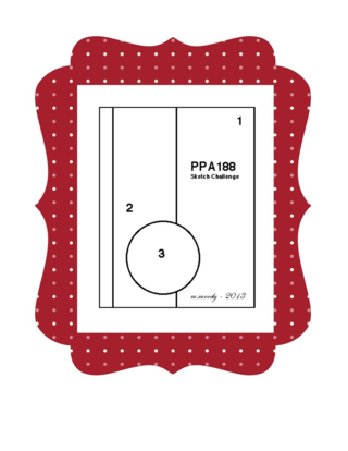
The inspiration for the layout of today's card was provided by this fun sketch over at CAS(E) this Sketch. I don't always get a chance to play along but they always have such fun and inspiring sketches!

Thanks so much for stopping by!

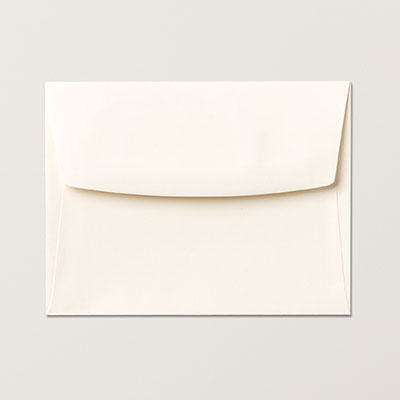
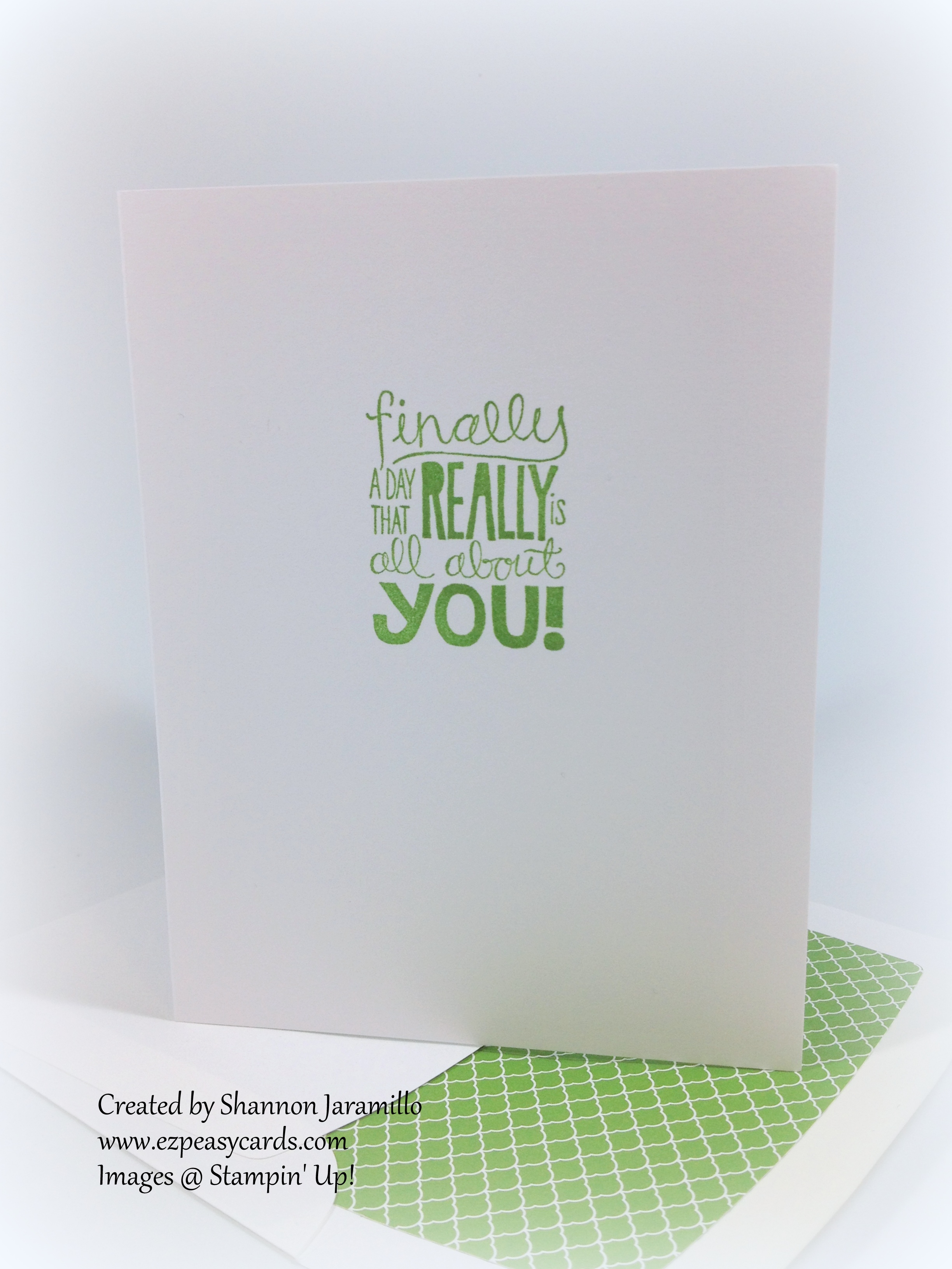
Oh! And in case you were wondering, the paper that I used to line the envelope today is a retired pattern (plain) from the Brights Color Collection Backgrounds Designer Series paper Stacks. At the time I wondered why on earth they would give me a plain colored piece of DSP, now, over four years later, I know...to line envelopes with! Hooray!

Life's an Adventure - RS#133

Life's an Adventure - RS#133

I borrowed the Life's Adventure stamp set from a friend recently and thought that the sketch this week over at Retro Sketches would be a perfect companion to my retro, kitschy bicycle stamp:

And then, when teamed up with these fun patterns from the Flashback Designer Series Paper, winner, winner, chicken dinner!

Life's an Adventure - RS#133

I love this bicycle and the sentiment! The bicycle would be fun as a stand alone image and you would be able to add lots of different sentiments, but it's so fun with this sentiment! Perfect for anyone starting out on a new adventure: moving to a new city; taking a new job or new apartment; or as in my case, a college grad starting their adult journey!

I stamped the image in Memento Tuxedo Black Ink and the stamped just the flag again in Real Red, snipped it out, and added it to my card. I think it's a fun accent. The rest of the card is pretty straightforward, no explanation needed. I did have to raid my retired stash for the Real Red and Pool Party buttons, but that's okay because the whole feel here is retro :)

Life's an Adventure - RS#133

Thanks for stopping by!


Oh Happy Day! - Pals Paper Arts Sketch Challenge #188

This card was inspired by this week's Pals Paper Arts sketch challenge:

All of Stampin' Up!'s coordinating products make creating cards so much fun! The images on today's card are from the Starburst Sayings stamp set and coordinate perfectly with the Starburst Framelits Dies. You can even purchase the two products bundled together and save!

How about these cleanly stamped images! Stampin' Up!'s firm foam ink pads make make it so easy to achieve these results. And I'm wondering how I ever got by without framelits! One of the things I love about framelits is that worrying about placement is a thing of the past. Just place your stamped image on your magnetic platform, line the framelit die up on top, and run it through the Big Shot. EZ Peasy! The framelits don't move because of the magnetic base. It's worth every penny invested in it, in my opinion!

I found this sentiment in the Really Good Greetings stamp set and think it pairs perfectly with "Oh Happy Day". At first glance you might think birthday but really, this card is perfect for lots of occasions. Do you know someone who got a new job? How about a promotion or a great score on their SAT? Made the drill team? Passed the driver's license exam? Found out they are pregnant or approved for adoption? Truly, the choices are endless. Keep the layout and just change up the colors!

If you've followed my blog at all, I don't need to tell you how I feel about Candy Dots. If you haven't purchased them, please give them a try! They are the perfect accent! If you have purchased them, do you love them as much as I do? Have a funny story to share about how you've used them? Please leave me a comment and share, I would love to hear your thoughts!

I hope you've enjoyed today's post. Please take a moment to pop over to the Pals Paper Arts Challenge and see all the wonderful projects the design team has come up with for this challenge. They work very hard to give us fun and challenging projects every week!

Stampin Supplies:

Stamps: Starburst Sayings (133185), Really Good Greetings (130333)

Paper: Whisper White (100730), Gumball Green (126840) Cardstock; Watercolor Wonder (132994) Designer Series Paper, 2012-2014 In Color (130137) Designer Series Paper Stacks (for envelope)

Ink: Gumball Green (126861), Summer Starfruit (126991), Pacific Point (126951) Classic Stampin' Pad

Tools:  Big Shot (113439); Envelope Liners Framelits Dies (132172); Starburst Framelits Dies (132967); Stampin' Trimmer (126889); Stampin' Dimensionals (104430)

Embellishments: Brights (130931), Regals (130932) Candy Dots

Thanks for stopping by!

Graduation Thank You

Follow Me on Pinterest

Today I wanted to share with you the graduation thank you cards that I made for my son to send out. My goal with these cards was to keep them simple enough for a twenty one year old young man to want to send out, yet elegant as well :) I used a retired sentiment (two years retired I believe) but I have kept the set because it is so timeless and versatile. I was SO pleased with how well it worked with the Labels Collection Framelits Dies! I changed up the embossing folders as I went.

I was very satisfied with how they turned out and my son was thrilled, so really, that's all that counts, right?!

Stampin Supplies:

Stamps: Engraved Greetings

Paper: Basic Gray, Whisper White CS; Twitterpated DSP

Ink: Basic Grey Classic Ink Pad

Accessories:  Big Shot, Stripes and Houndstooth Embossing Folders, Labels Collection Framelits, Dimensionals

Thanks for stopping by!